 |
| Vincent Van Gogh 'Sunflowers' c.1888 |
As you may have noticed from my previous posts and paintings, nature, especially flowers, is an ongoing theme in my creative work. I love the rich source of metaphors and storytelling it offers, adding further dimension to my practice. It also lends opportunity to study colour, and its impact on psychology, emotions, and artistic expression and that’s what we’re going to look at in this post.
Despite the dreich (dreary or bleak) tendencies of our wonderful Scottish weather, I still walk on most days. Sadly, the warm autumn colours are past and wet leaves litter the ground, but there are still pops of colour that grab my attention. Against the winter’s muted tones, those small colourful bursts draw the eye, a timeless technique artists have been using for centuries.
I’d like to share with you how colour can affect our psychology, how we can use it to our advantage and expose some artists’ tricks in using colour to draw us in and make us feel a certain way. And, of course, a bit of science to make it all more believable or not 😉.
Cracking the Chromatic Code: A Historical Perspective
Colour psychology is the study of how colours can influence human behaviour, emotions, and perceptions. It aims to understand how colour affects our moods and decision-making. When it comes to business, research shows that the proper use of colour increases brand recognition by 80% and 85% of consumers buy because of colour .
The formal study of colour psychology is relatively new, starting in the twentieth century, however, the belief in the power of colour dates back to ancient times as cultures around the world recognised the impact of colour on well-being.
A True Story
The Egyptian God Thoth, born from the lips of Ra at the beginning of creation, was the founder of colour therapy. This form of therapy was connected to the Egyptians' worship of the sun, and they believed that harnessing the sun's rays through coloured crystals had healing effects on the body. They took this knowledge further by building temples dedicated to healing through light. These temples featured different rooms, painted in specific colours that related to their healing properties.
Avicenna, a Persian polymath, born in 980 AD, is credited with advancing colour's role in diagnosing and treating diseases, expressing the view that ‘Colour is an observable symptom of disease.’ He observed that a person with a nosebleed should not gaze at things of brilliant red and should not be exposed to red light because this would stimulate the sanguineous humour, whereas blue would soothe it and reduce blood flow.
In 1810, German poet and artist Johann Wolfgang von Goethe published one of the earliest works on colour psychology, in his book ‘Theory of Colours.’ Here, he explored how colours could induce specific emotions. Despite initial scientific rejection, some of Goethe's insights, particularly regarding the impact of colours on mood, have been validated by modern research.
Kurt Goldstein, an influential German neuropsychologist, expanded on Goethe's ideas, conducting experiments in 1942 that suggested certain colours could affect motor function. Though Goldstein's specific colour hypotheses faced challenges, his work significantly contributed to the foundation of modern colour psychology, popularising the concept that colours can stimulate physiological responses, a theme still studied today.
Swiss psychiatrist Carl Jung (1875-1961) expressed, ‘colours are the mother tongue of the subconscious.’ His studies in the field led him to develop art therapy, emphasising the use of images and colours as a means for patients to express themselves and recover from trauma or distress. That must be why I am so sorted. Jung also connected cultural perceptions with the idea that there is a universal, bodily response to colour stimulus, contributing to our understanding of the psychological impact of colour.
Modern Colour Psychology
Modern colour psychology research looks at how colours impact our bodies, influence our emotional and behavioural responses and our favourite colour choices.
1. Bodily Reactions to Colour Exposure
To understand our bodily reactions to colour exposure, researchers measure indicators such as blood pressure, heart rate, and brain activity. Red emerges as a stimulant, while blue offers a serene respite. Warm tones ignite excitement, while cool tones offer calmness.
2. Colour and Emotions
To measure the emotional effects of colour, researchers use psychological tests such as semantic differential scales. This is a scale like a customer satisfaction questionnaire, 7 means fantastic and, 0 means bloody awful. Instead of numbers, emotional words like Happy = 7 and Sad = 0 are used. Participants are asked to choose where a colour belongs on the scale. However, doesn’t our mood of the day or time of enquiry dramatically influence how we answer?
3. Colour Preferences
In the area of preferences, studies often involve asking people to rank a series of colours. Blue consistently takes the lead as the crowd-pleaser, closely followed by red or green. We lean towards bright, vivid colours, with darker shades such as brown, black, and murky greens receiving a cold reception.
4. Seeing Red - Colour and Behaviour
In behaviour tests, researchers stage scenarios. In a study published in the ‘Journal of Experimental Psychology,’ researchers found that red negatively affected performance on a test. When participants were given a red participant number (rather than green or black), they scored 20% lower than their peers.
What Are You In The Mood For? Feeling Blue? In the Pink?
As mentioned above, colour can have an impact on how we feel. Research suggests the following, but feel free to make up some of your own because we also make colour associations based on our experiences:
- Yellow: Cheerful and optimistic, happiness and smileys 😄. It can bring a sense of positivity and optimism.
- Orange: Happiness, enthusiasm, warmth, energy.
- Red: Bold and passionate, love, anger, and energy. It can symbolise warmth and intensity.
- Purple: Regal and mysterious, often associated with luxury, royalty and spirituality. It can convey a sense of elegance and creativity.
- Blue: Calming and serene, often associated with tranquillity, depth, and introspection. Also, sadness and loneliness.
- Green: Nature and growth, balance, harmony, and renewal. It can promote feelings of freshness (think menthol) and calm.
- White: Purity, innocence, cleanliness, coolness.
- Black: Strength, elegance, mystery, darkness, fear, death.
How Artist’s Use Colour to Grab Attention
The colour we tend to notice first is yellow. This is because yellow is at the centre of the visible spectrum of light, and our eyes are most sensitive to wavelengths around 555 nanometers, which corresponds to yellow-green light.
While I imagine Vincent Van Gogh (1853 - 1890) was unaware of this phenomenon, he painted five large canvases of sunflowers in a vase using three shades of yellow and nothing else. The paintings were created in Arles in the south of France from 1888 - 89. He proved that he could create a series of beautiful and impactful paintings of the same subject using the same limited palette, while maintain expression and intensity. The paintings held a special significance for Vincent; they symbolised ‘gratitude,’ he wrote.
Art Bite: Vincent painted a variety of flower still lifes, like many other artists of the time. However, he then chose to take a different approach and chose a specific variety, the sunflower. Sunflowers were considered unsophisticated by his peers but Vincent enjoyed their rawness and also liked to paint them when they had gone to seed. After he died, friends brought sunflowers to his funeral, and the sunflower became associated with Vincent, just as he had hoped.
The Red Trick
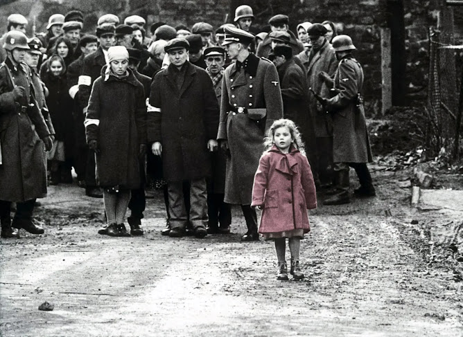
Even though we notice yellow first, red is often the money shot. This is because it creates the strongest contrast against many other colours and artists use this to draw attention to specific elements of a painting or to guide our eye around the composition in the way they intend. Our eyes are drawn to contrast. For example, while walking this morning, I was quickly pulled out of my reverie by the site of red berries. They were in contrast with the green leaves of the foliage and the muted tones of the surrounding trees and shrubs. It felt uplifting, a pop of colour along the damp, dark path.
Do you remember this? What do you feel when you look at this image?
 |
| Scene From The Movie 'Schindler's List' (1993) |
French artist, Jean-Baptise-Camille Corot (1796-1875) was rather opposed to colour, instead focusing on the harmony of tones and a muted palette. However, in most of his landscapes, there is a small spark of red or scattered dots of intense colour to enliven the painting and enhance the grey tones, see the image below. Can you spot the red?
 |
| Fisherman Moored at a Bank, c.1870, oil on canvas |
Conclusion
As we wrap up this exploration into the world of colour, we've journeyed through ancient practices and modern theories, but is there really a conclusion about colour’s influence on our psychology? How much of it is subjective? I would suggest a great deal.
Artists, do indeed use colour to create impact, mood and so on but, at the end of the day, it is you, the audience who decide what it means to you and how it makes you feel. When you next look at an image, focus on the colour palette and ask yourself, ‘what am I feeling right now?’ You can try this on a different day, when you are in a different mood and see how your feelings compare. Subject matter can also play a significant role so, for this experiment, I suggest selecting an image that is innocuous and isn’t going to trigger a barrage of emotions and memories; perhaps a flower painting 😉
Speaking of, I’m working on abstract flower paintings right now. Abstraction doesn’t come naturally to me at all so it’s a learning process, longer than I’d like. You can have a peak here.
Be The First to Know
To discover new works, insights from art history and the power of storytelling, Click here
For more art, follow me on Instagram and Facebook
Jane E Porter is a fine artist and illustrator from Scotland, dedicated to exploring and understanding the fascinating interplay between art, psychology and philosophy. As she navigates her own search for meaning, she shares insights and observations made over the past two decades with a delightful mix of wit and wisdom. Join her as she continues her journey, delving into these themes, offering you fresh perspectives and insights on art, identity and storytelling.


